modify slide 51
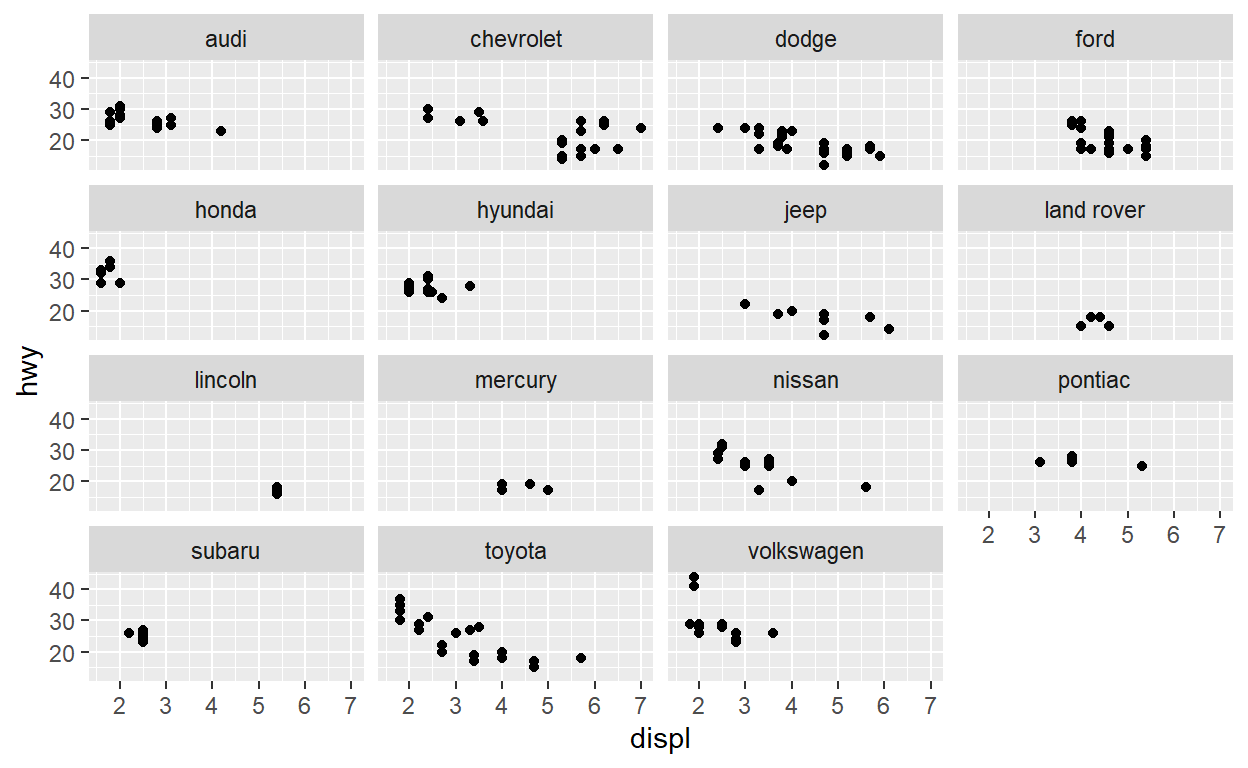
Create a plot with the mpg dataset add points with geom_point assign the variable displ to the x-axis assign the variable hwy to the y-axis add facet_wrap to split the data into panels based on the manufacturer
read_csv("https://estanny.com/static/week8/spend_time.csv")
# A tibble: 50 x 3
   activity        year avg_hours
   <chr>          <dbl>     <dbl>
 1 leisure/sports  2019      5.19
 2 leisure/sports  2018      5.27
 3 leisure/sports  2017      5.24
 4 leisure/sports  2016      5.13
 5 leisure/sports  2015      5.21
 6 leisure/sports  2014      5.3
 7 leisure/sports  2013      5.26
 8 leisure/sports  2012      5.37
 9 leisure/sports  2011      5.21
10 leisure/sports  2010      5.18
# ... with 40 more rowsggplot(data = mpg) +
geom_point(aes(x = displ, y = hwy)) +
facet_wrap(facets = vars(manufacturer))
Question: modify facet-ex-2
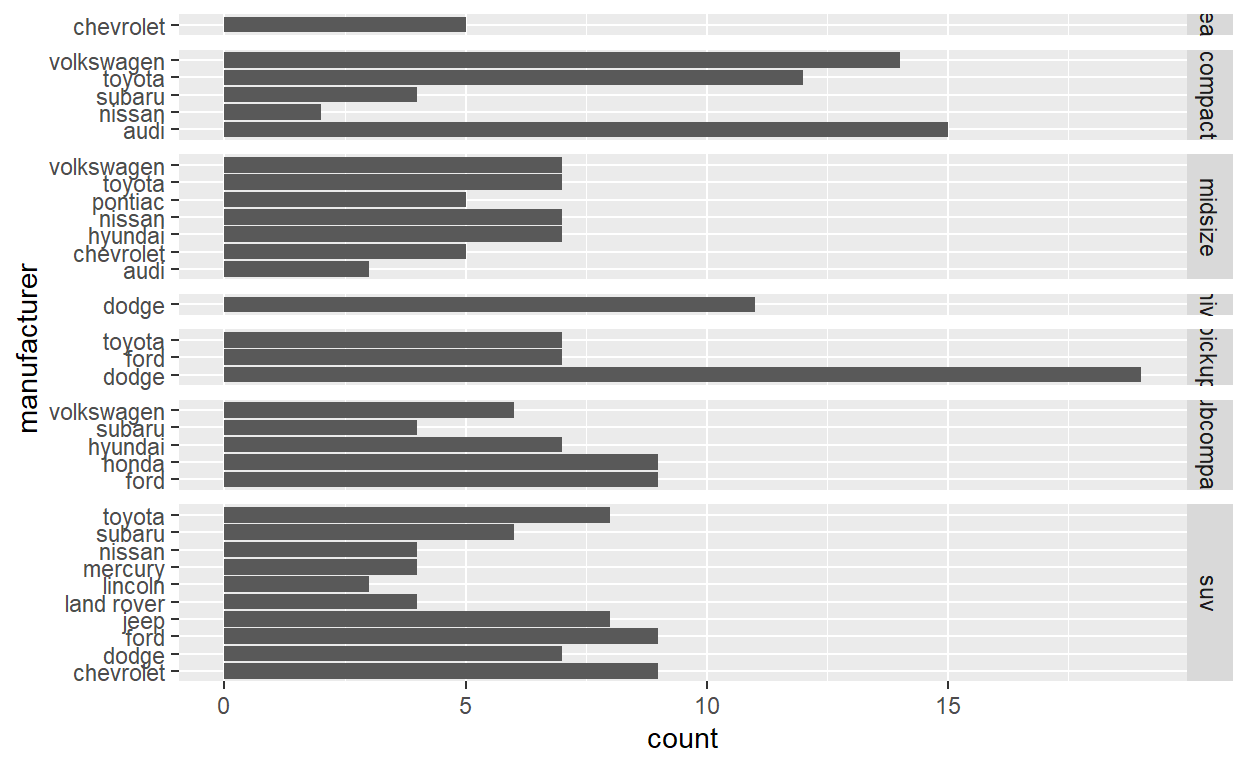
Create a plot with the mpg dataset add bars with with geom_bar assign the variable manufacturer to the y-axis add facet_grid to split the data into panels based on the class let scales vary across columns let space taken up by panels vary by columns
ggplot(mpg) +
  geom_bar(aes(y = manufacturer)) +
  facet_grid(vars(class), scales = "free_y", space = "free_y")
#Question: spend_time To help you complete this question use:
the patchwork slides and the vignette: https://patchwork.data-imaginist.com/articles/patchwork.html Download the file spend_time.csv from moodle into directory for this post. Or read it in directly:
read_csv(“https://estanny.com/static/week8/spend_time.csv”)
spend_time contains 10 years of data on how many hours Americans spend each day on 5 activities
read it into spend_time
read_csv("https://estanny.com/static/week8/spend_time.csv")
# A tibble: 50 x 3
   activity        year avg_hours
   <chr>          <dbl>     <dbl>
 1 leisure/sports  2019      5.19
 2 leisure/sports  2018      5.27
 3 leisure/sports  2017      5.24
 4 leisure/sports  2016      5.13
 5 leisure/sports  2015      5.21
 6 leisure/sports  2014      5.3
 7 leisure/sports  2013      5.26
 8 leisure/sports  2012      5.37
 9 leisure/sports  2011      5.21
10 leisure/sports  2010      5.18
# ... with 40 more rows
spend_time <- read_csv("https://estanny.com/static/week8/spend_time.csv")
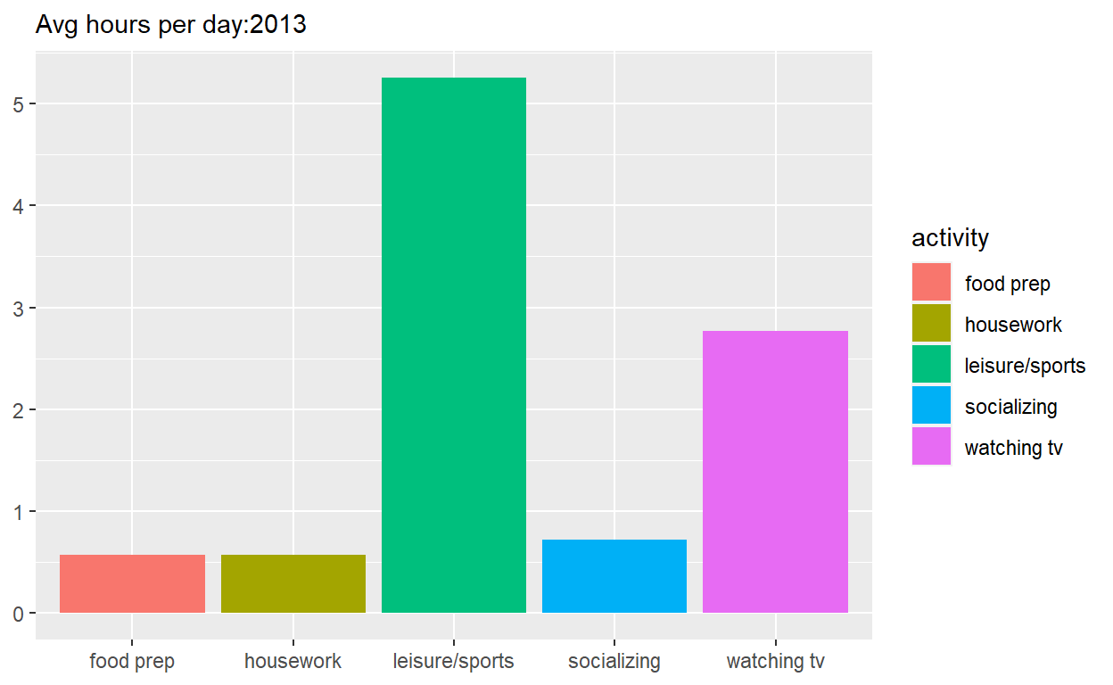
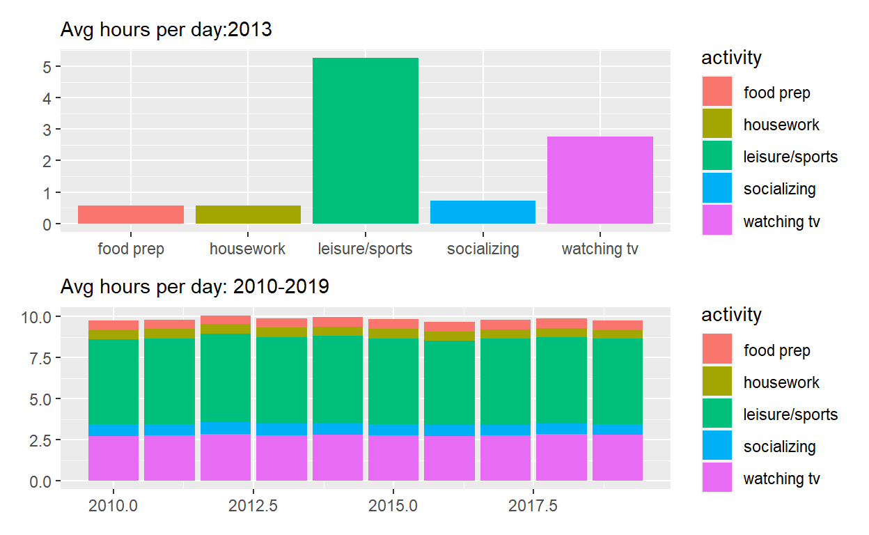
p1  <- spend_time %>% filter(year == "2013")  %>%
ggplot() +
  geom_col(aes(x = activity, y = avg_hours, fill = activity)) +
  scale_y_continuous(breaks = seq(0, 6, by = 1)) +
  labs(subtitle = "Avg hours per day:2013", x = NULL, y = NULL)

p1
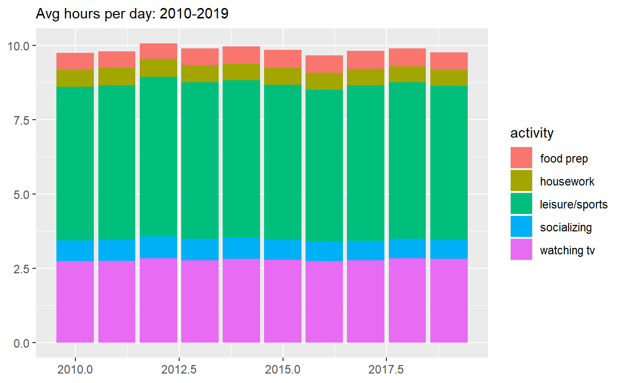
p2  <- spend_time  %>%
ggplot() +
  geom_col(aes(x = year, y = avg_hours, fill = activity)) +
  labs(subtitle  = "Avg hours per day: 2010-2019", x = NULL, y = NULL)

p2
Use patchwork to display p1 on top of p2
assign the output to p_all display p_all
p_all  <-  p1 / p2

p_all
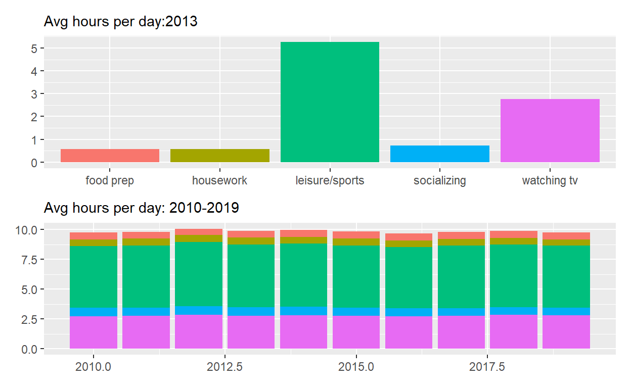
p_all_no_legend  <- p_all & theme(legend.position = 'none')
p_all_no_legend
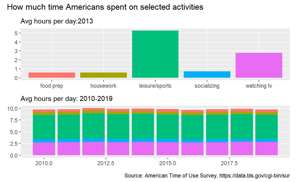
p_all_no_legend  +
 plot_annotation(title = "How much time Americans spent on selected activities",
                  caption = "Source: American Time of Use Survey, https://data.bls.gov/cgi-bin/sur")
#question : patchwork 2
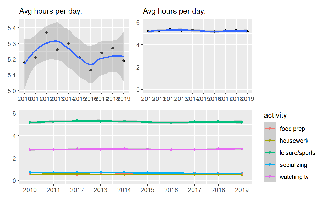
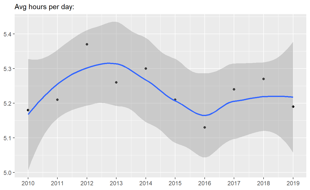
p4  <-
spend_time %>%  filter(activity == "leisure/sports")  %>%
ggplot() +
  geom_point(aes(x = year, y = avg_hours)) +
  geom_smooth(aes(x = year, y = avg_hours)) +
  scale_x_continuous(breaks = seq(2010, 2019, by = 1)) +
  labs(subtitle = "Avg hours per day:", x = NULL, y = NULL)

p4
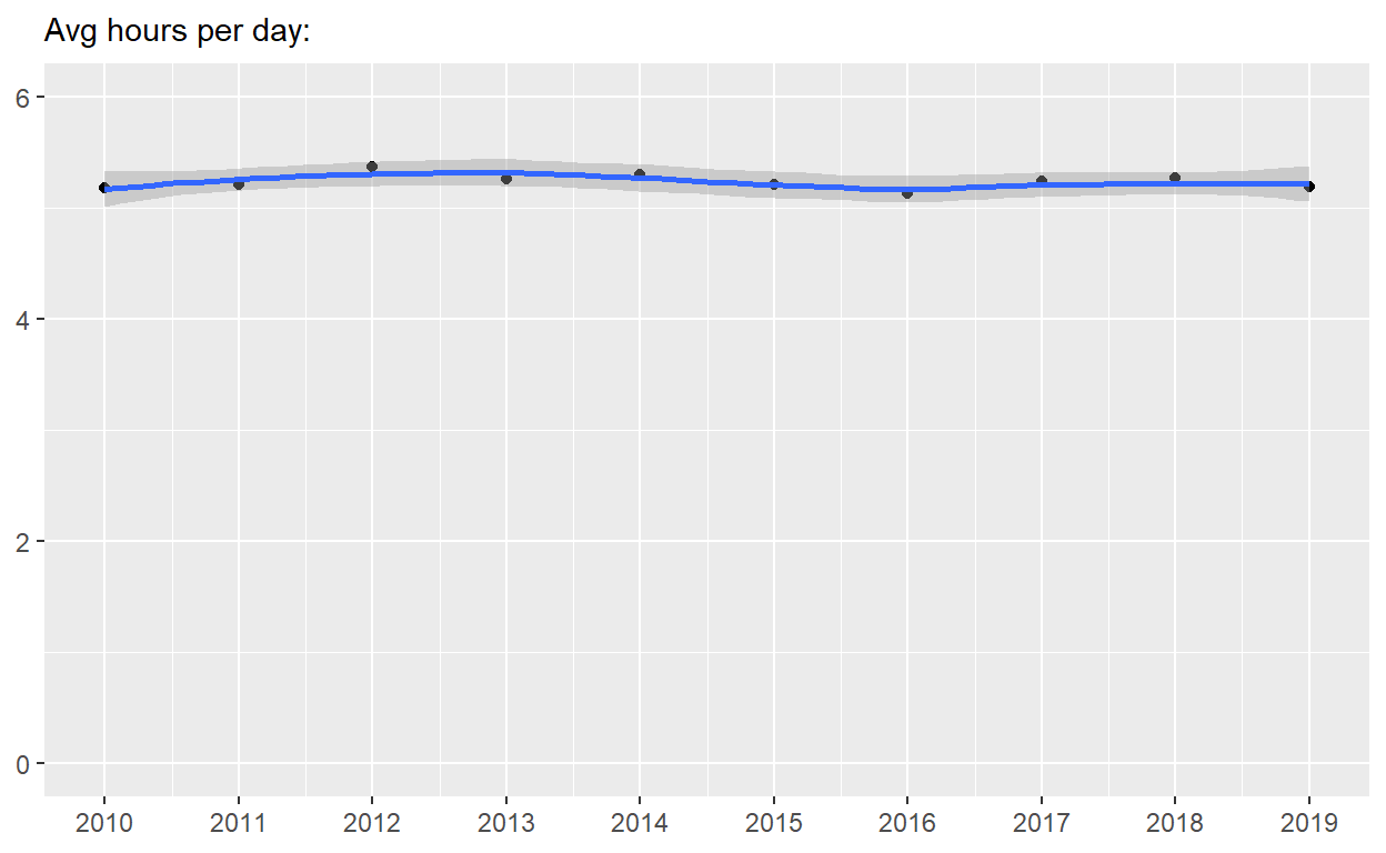
p5 <-  p4 + coord_cartesian(ylim = c(0, 6))
p5
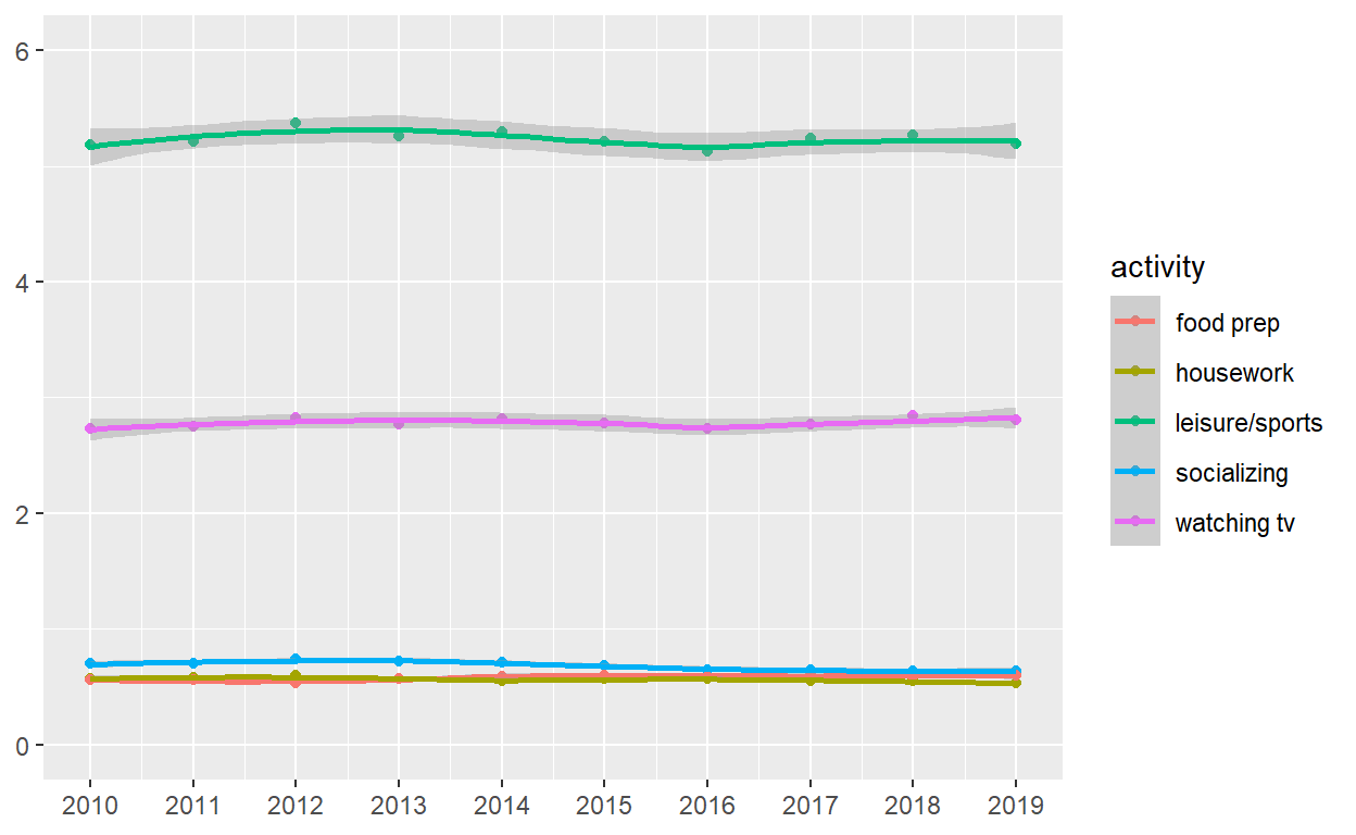
p6   <-
 spend_time  %>%
ggplot() +
  geom_point(aes(x = year, y = avg_hours, color = activity, group = activity)) +
  geom_smooth(aes(x = year, y = avg_hours, color = activity, group = activity)) +
  scale_x_continuous(breaks = seq(2010, 2019, by = 1)) +
  coord_cartesian(ylim = c(0, 6)) +
  labs(x = NULL, y = NULL)

p6
( p4 | p5) / p6